UX Strategy - Think Company
Product and business teams: What do you do, exactly?
Procurement teams: Do you have the capability I’m looking for?
Potential employees: What’s it like to work here?
Based on user feedback provided by the Think leadership team, our website failed to answer the first two questions. Plus, Think faced an additional content strategy challenge: they lacked a clearly-defined voice and tone. We held two 3-day spikes to redefine the user experience and prepare documentation for handoff to a studio team for website design.
Process
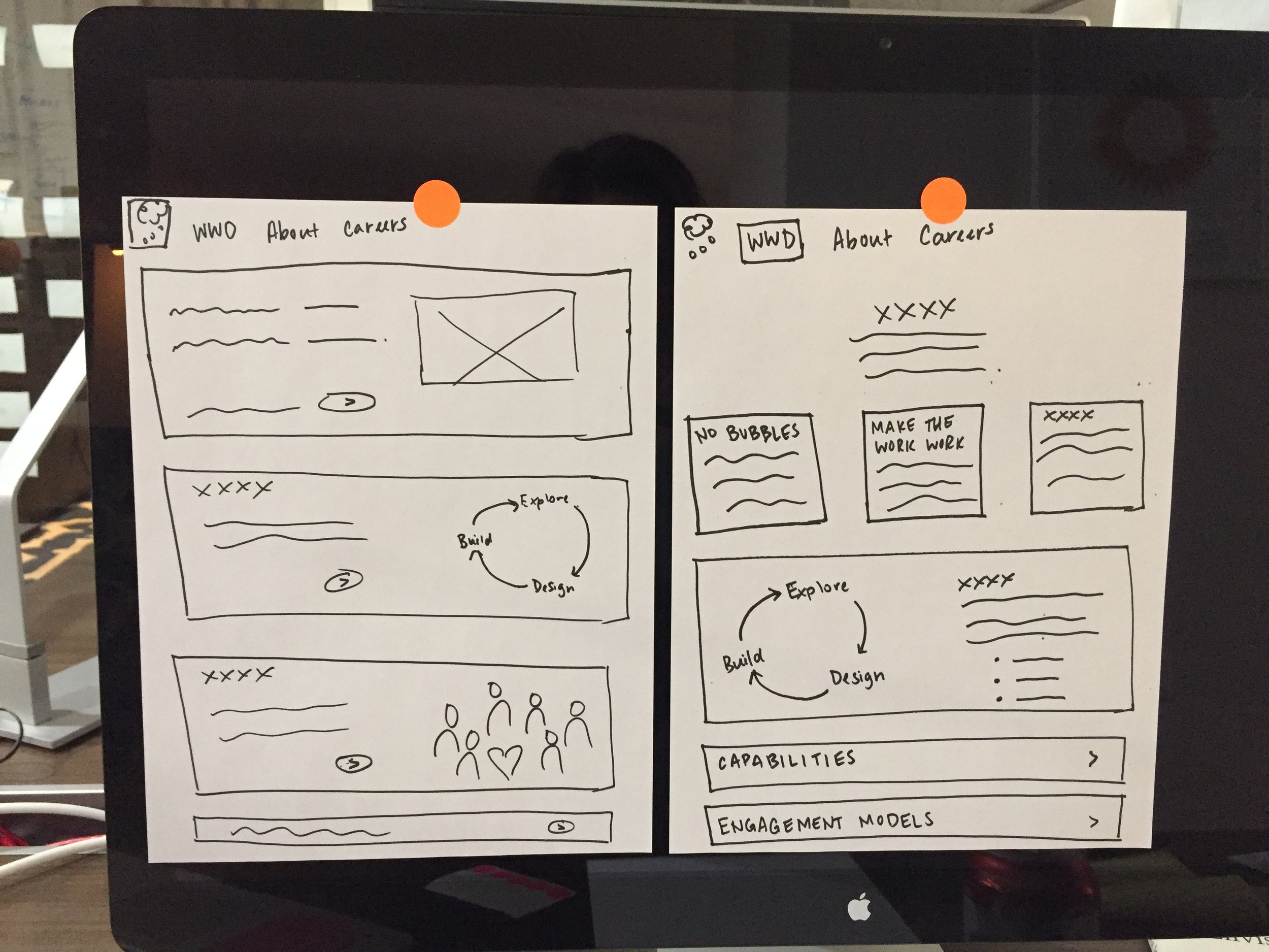
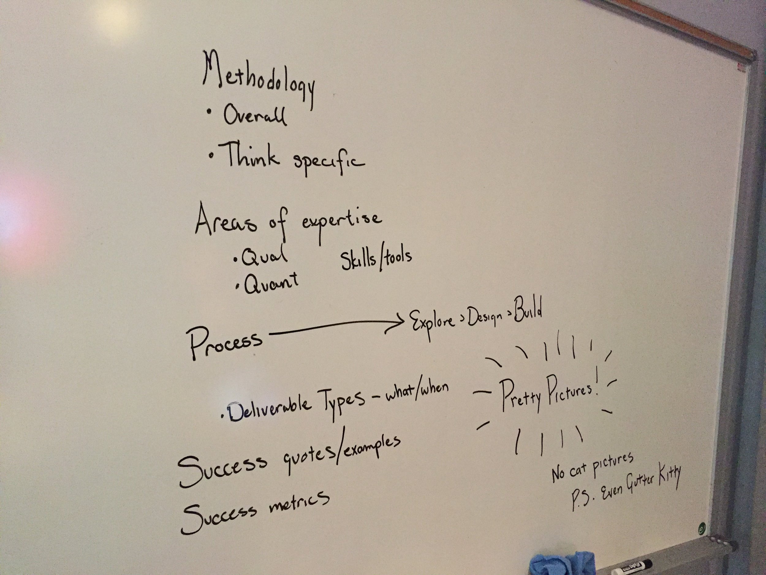
Our first spike was a 3-day exploration around website structure and storytelling. We explored the existing Think website for opportunities to address user questions more effectively. After mapping and re-mapping flight paths and user flows, we landed on a conceptual IA restructure that balanced high-level exploration with deep diving for additional context.
The updated IA provided information paths based on common user questions.
Based on conversations with leadership, I created several story concepts to explore potential content directions. I also presented an updated model concept to demonstrate the Think approach to experience design. This model was used as the basis for several content templates.
Our second 3-day spike focused on content strategy and modeling. Though not the main focus of the project, I created high-level editorial guidelines to help steer content creation.
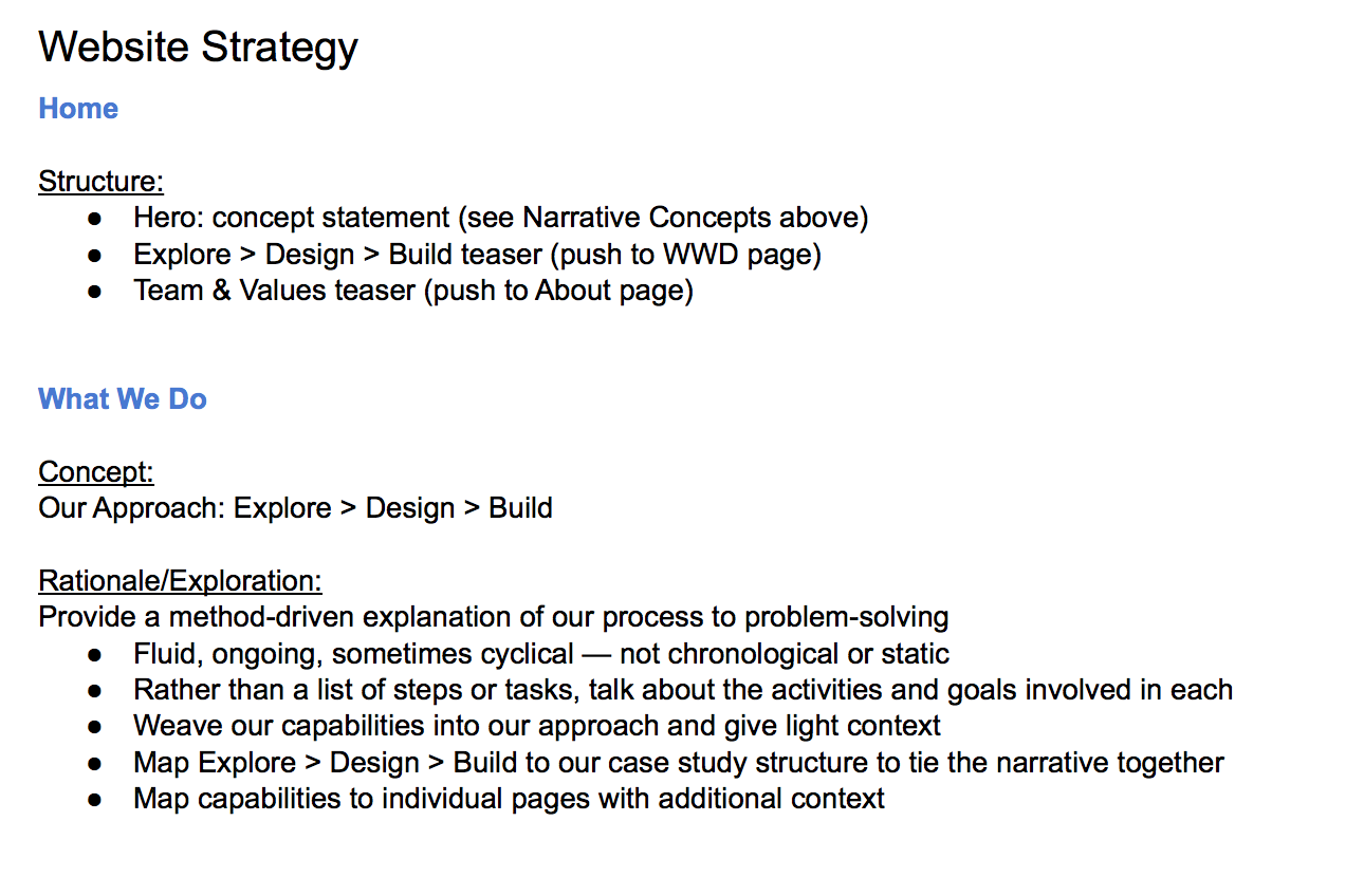
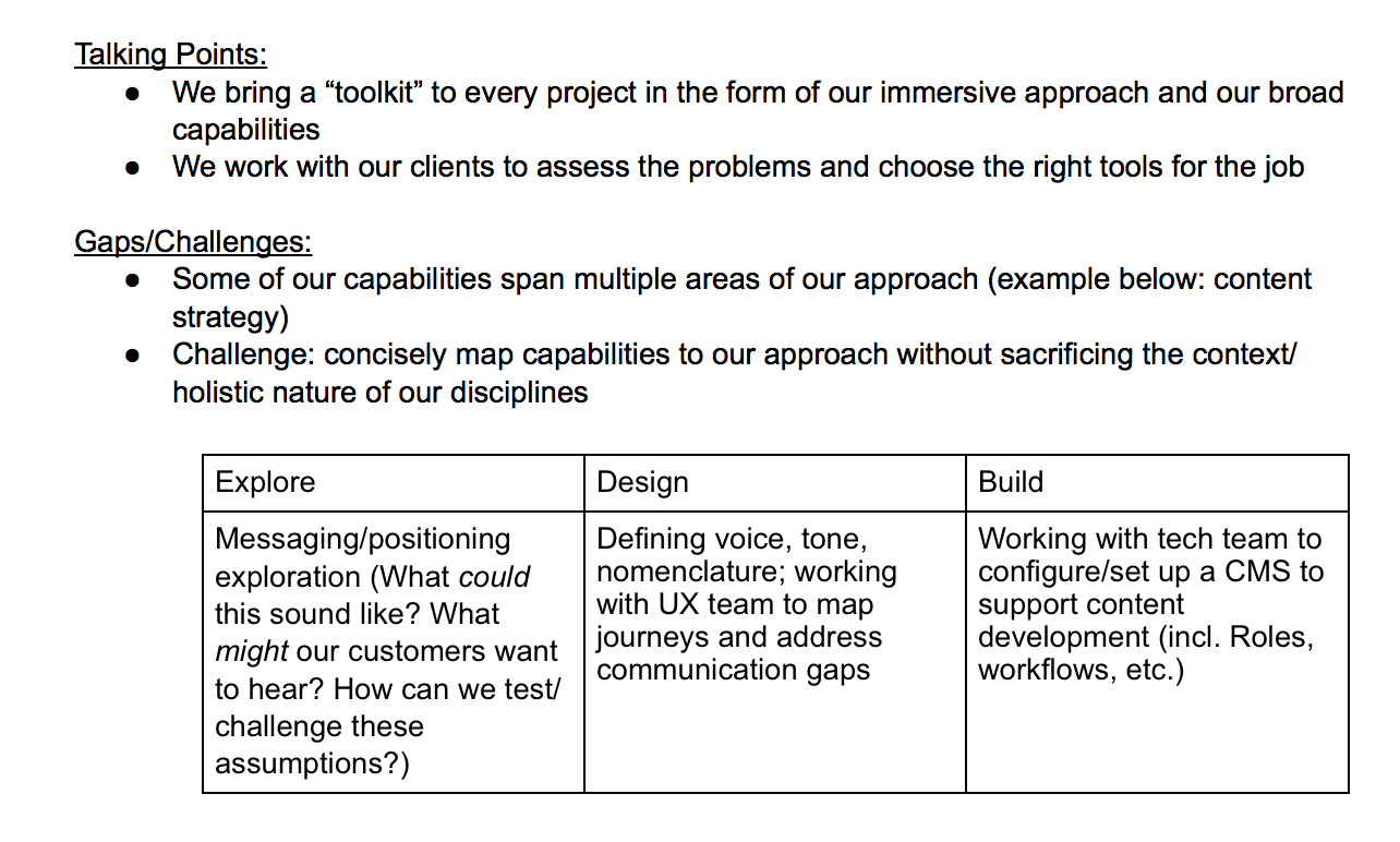
I worked on website strategy and high-level wireframes to give UX designers a sense of site usability and messaging flow, and created directional content structures to make it easier for a copywriter to run with the strategy.
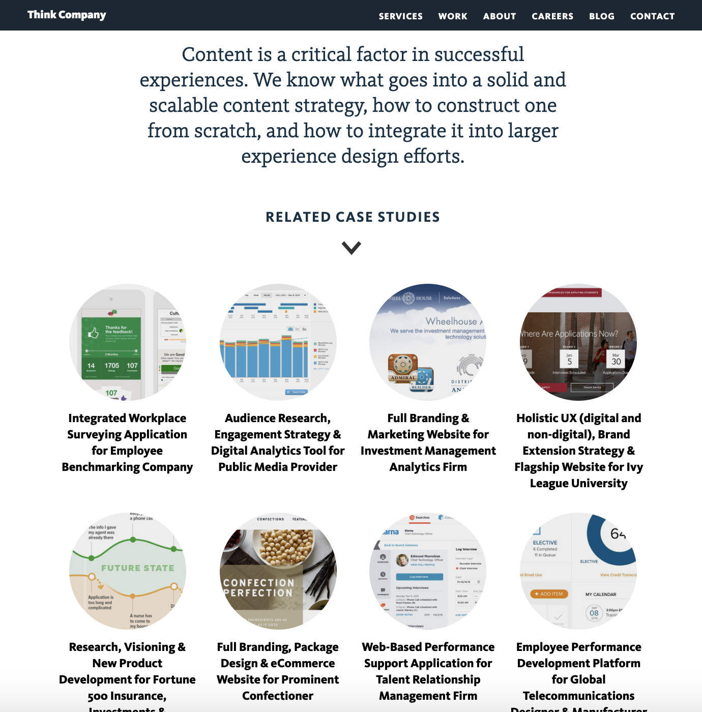
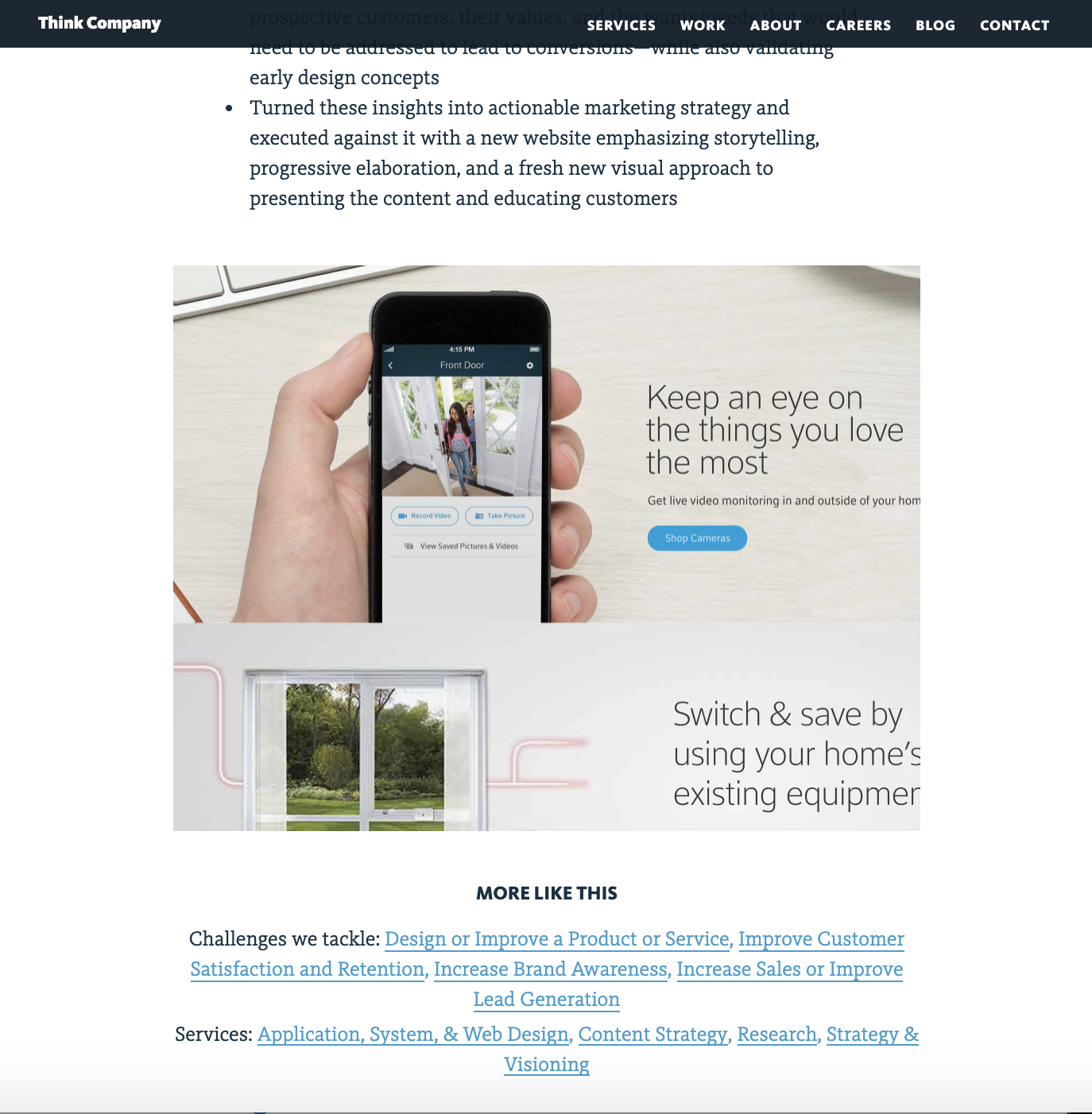
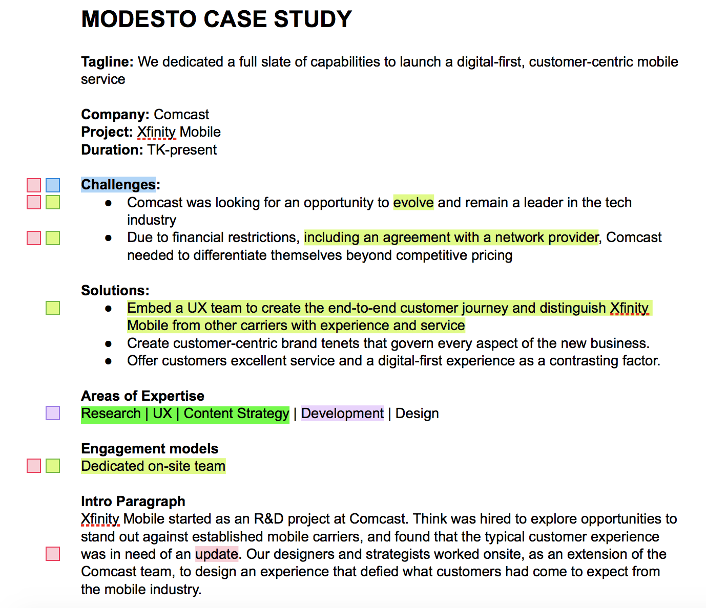
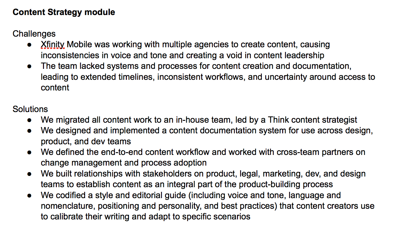
Since the case studies were our most complex content type, I worked with another copywriter to draft a case study for Xfinity Mobile as a model.
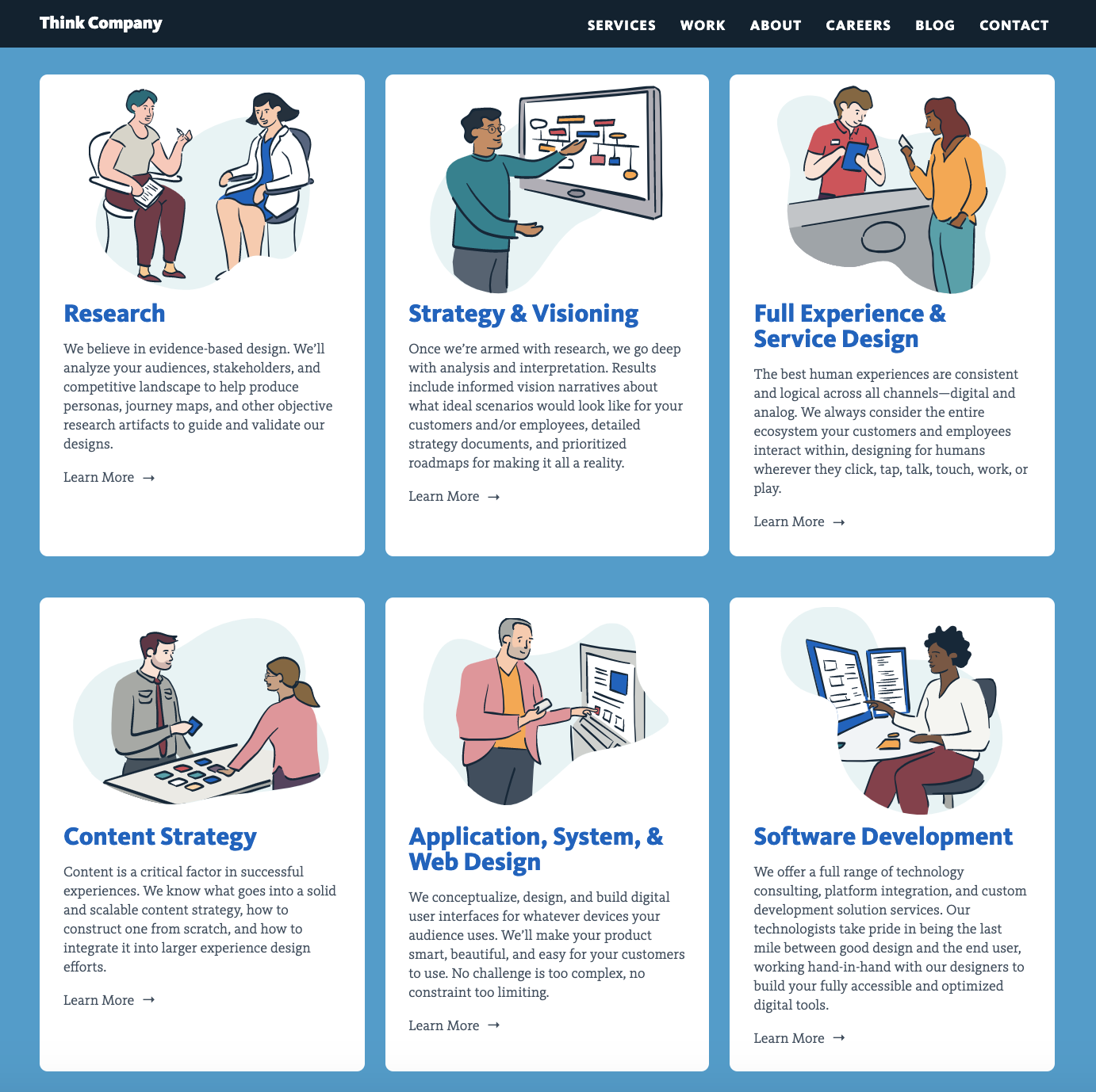
The final website puts a spotlight on case studies and core capabilities at Think, and incorporates a tagging system that helps users move through relevant content. The IA intuitively navigates several user types and questions without feeling cluttered or overwhelming.
