Design Sprint - Xfinity Mobile
When we got approval for an exploration project to improve the Xfinity Mobile marketing site, we decided to lean on the Design Sprint process to quickly generate, refine, and test our ideas.
My role
I collaborated with two designers and a product owner to create a research plan, generate comparative research, run expert interviews, and define our problem statements. I then co-facilitated an ideation workshop, refined concepts, and wrote copy for our prototype.
PROCESS
We used several research methods to better understand what worked (and didn’t) on our current landing and plan pages:
Expert interviews with design, marketing, product, and development stakeholders
Analogous and competitive audits of Learn experiences
Synthesized data from Adobe Analytics
Based on our findings, we defined six key problems with the existing experience:
Our pages are a one-way conversation
Our pages are doing too many jobs
Users don’t understand By the Gig
Users feel trapped, so they call
We’re not built for promotions
Our landing page is ineffective
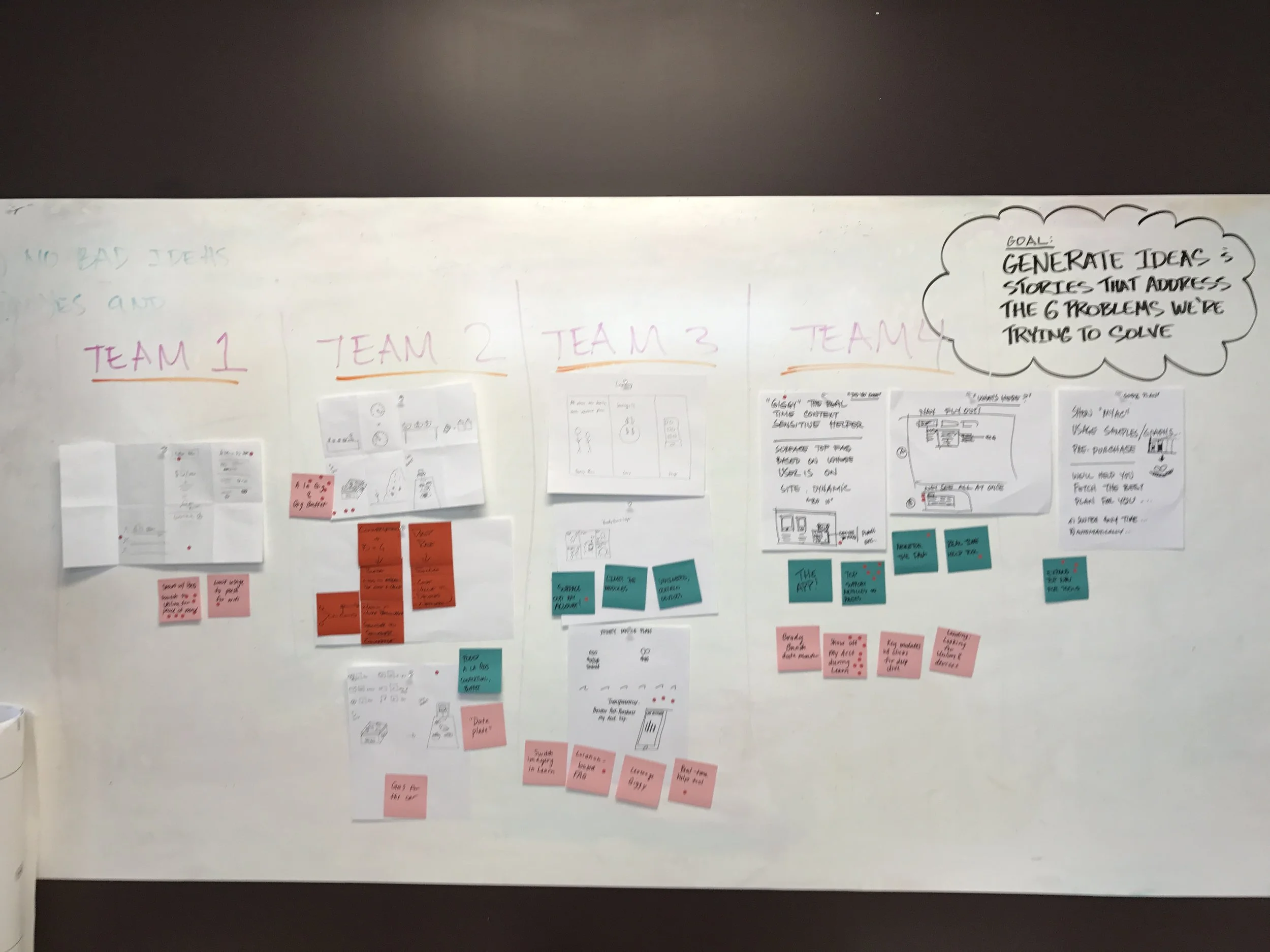
We held a stakeholder workshop to address these key problems and generate ideas. The workshop included an exhibit-style walkthrough of the problems, followed by several sketching sessions. After the workshop, we synthesized and refined the concepts to start working toward a prototype.
Results of a team sketching activity
Concept refinement
Early sketch of a refined concept
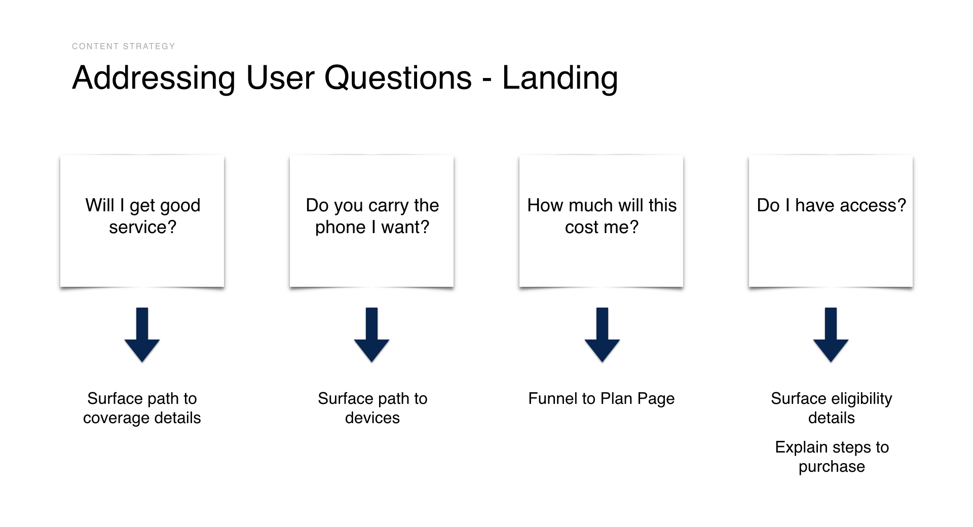
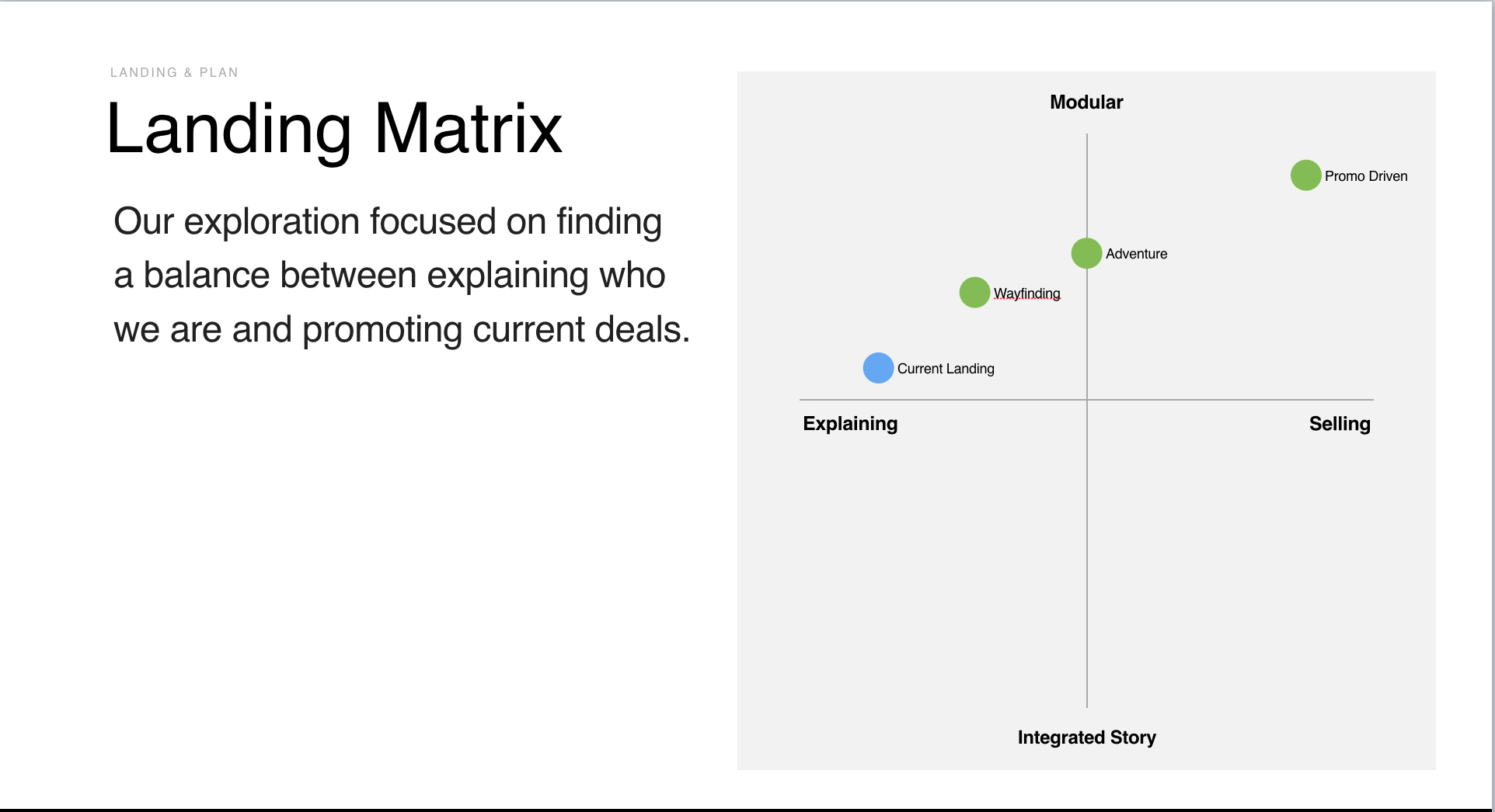
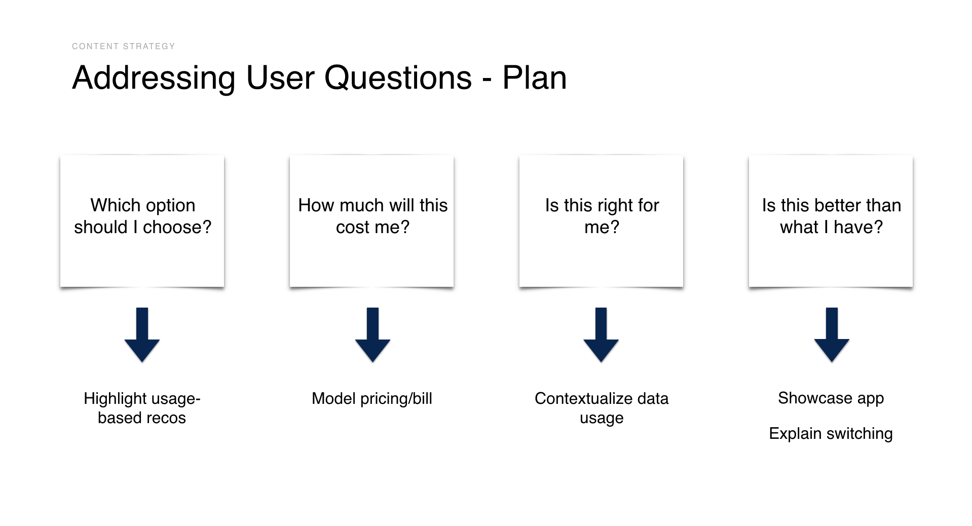
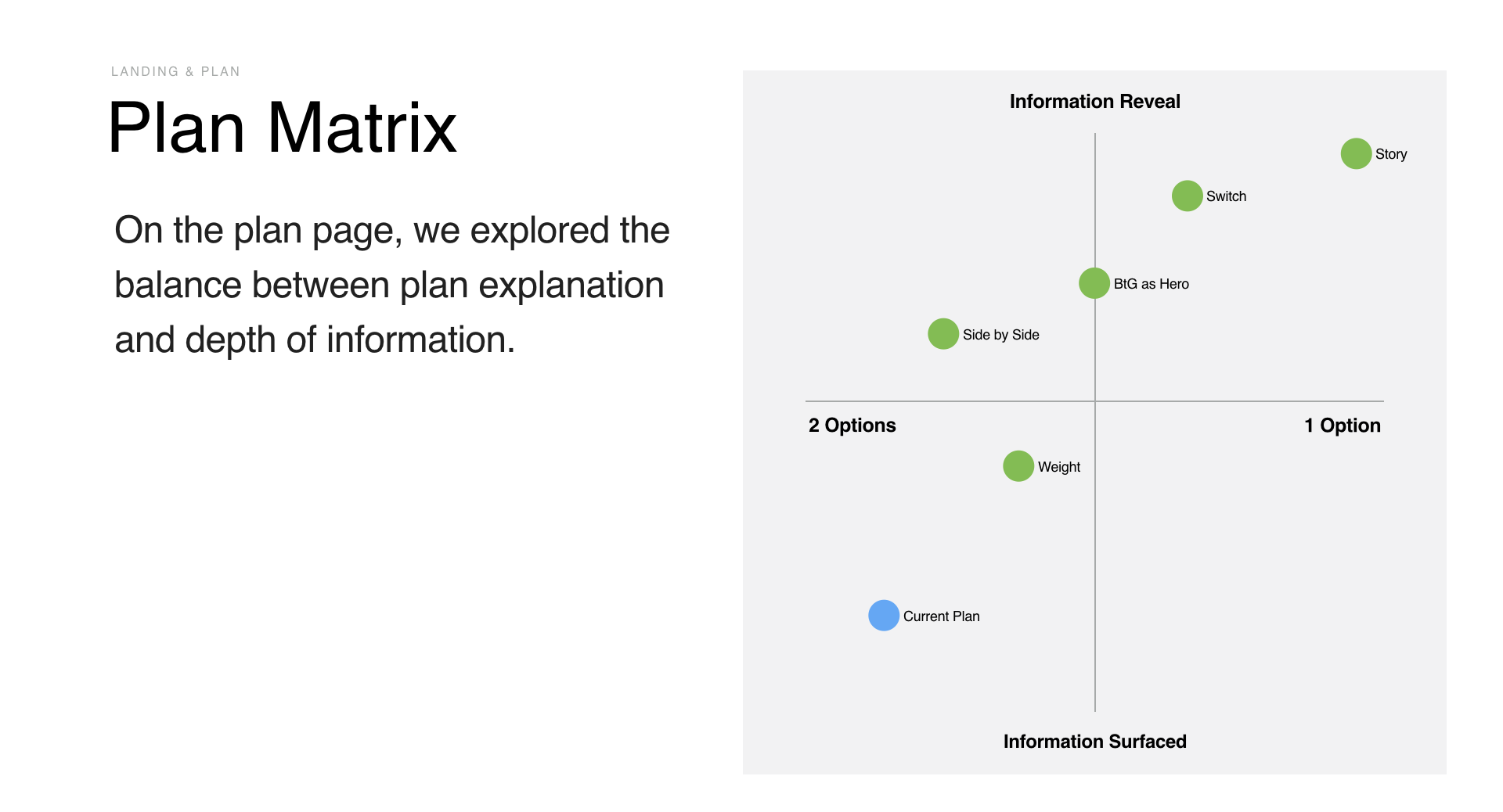
Based on our research and workshop findings, we developed a perspective and several concepts for the new pages. The content strategy mapped user questions to specific experience goals and "just in time" content, and our concept matrix allowed for variations in focus and intensity of the design and messaging.
Outcomes
As a result of the Design Sprint, we generated buy-in across teams to build a new marketing experience with structural flexibility to accommodate promotions that could change quickly. The experience we created still serves as the main focus of the site.
Wireframe of the promo-driven concept
Promo-driven hero on the XM website in 2019
