Design System - Xfinity Mobile
Summary
As the team and product scaled, we struggled to remain efficient without a fully-developed design system. Velocity was slowing because design, dev, and content teams were all using and referring to components in different ways, and we were spending more time getting on the same page than delivering work.
We started work on the design system with three key deliverables in mind:
Universal language
Usage standards
Reliable documentation
My role
I designed and led a half-day workshop with product teams using generative UX research methods. When the design system started taking shape, I shifted gears to oversee information architecture and develop usage guidelines for the components.
Process
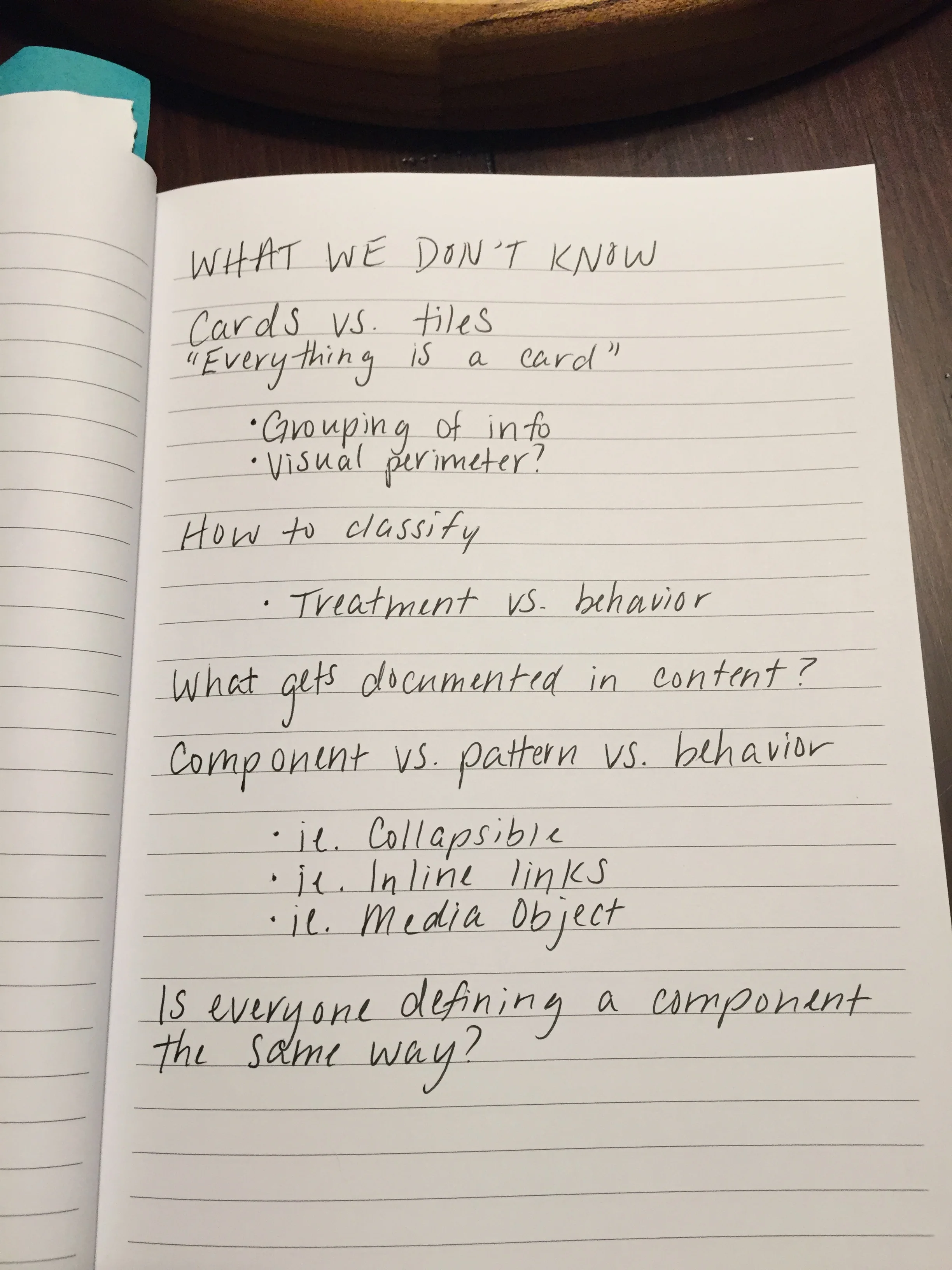
First, we catalogued design and content components and bundled pattern variations. We found nearly 100 component types across the experience, and identified questions that we wanted to address:
We then held a taxonomy workshop to involve our stakeholders in the organization of our components. We aimed to leave the workshop with a sense of information architecture for the components, as well as a pool of agreed-upon language to pull from when building the taxonomy.
Our first step in creating a universal language was making sure everyone on the team had the same definition of a component. This screen shot is part of a discussion we had early in the workshop.
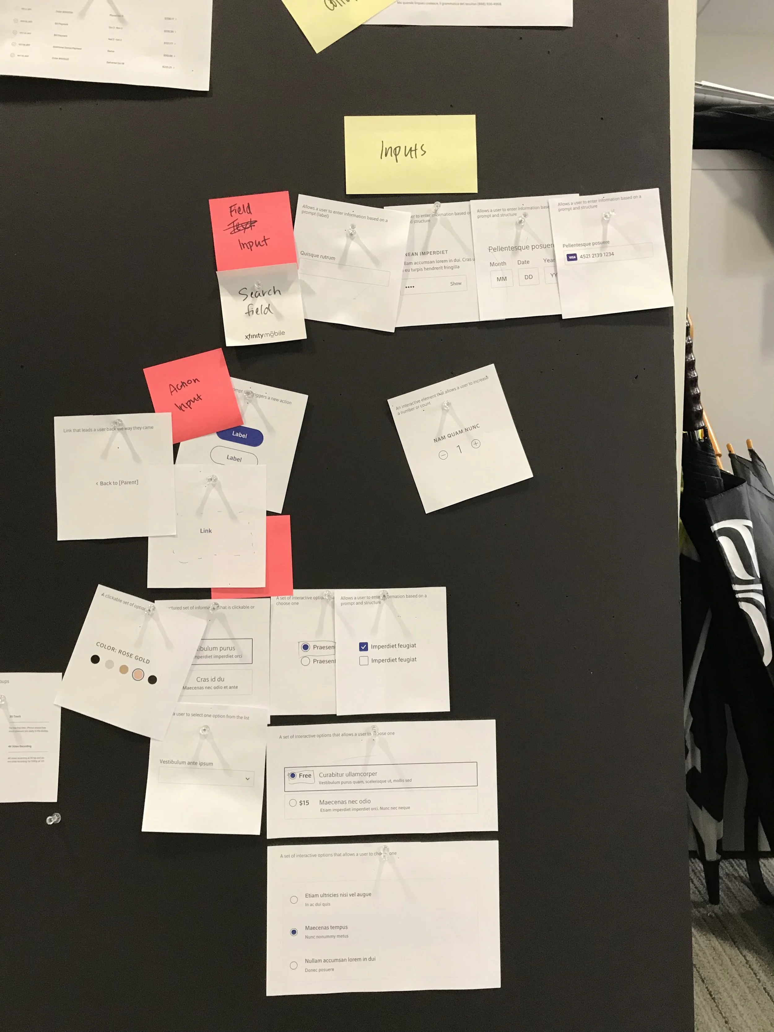
The meat of the workshop included a collaborative card sorting and affinity mapping exercise, followed by a group discussion about component categories and definitions. Across dev, design, marketing, and accessibility teams, there were plenty of strong and often conflicting perspectives. This healthy debate helped us understand the mental models associated with component usage.
Based on workshop outputs, as well as a study of publicly-available design system taxonomies, we worked through several iterations of component grouping and categorization. In the end, we landed on a tiered IA that defined components based on whether they were informational or actionable.
Once we finalized naming, I defined editorial guidelines, documented the taxonomy structure, and grouped components based on functionality and use cases. The content strategy documentation was entered into Invision DSM for Sketch.
Affinity mapping of input components during our workshop (left) created the basis for final documentation (above).
“Amy and I worked together on a design system and thanks to her, it’s become an invaluable asset to our team and beyond. She’s collaborative, resourceful and a genuine pleasure to work with. I can’t stress this enough but Amy’s contribution to our team has been extraordinary.”


